
Monday, December 15, 2008

Back Package Design

Note about this picture: The white space in the upper left corner would not be there once placed on package.


Final Project
So for the final project we needed to create a hypothetical product that will remove carbon from the earths atmosphere. My product is a ice melting rock salt that, while evaporating, the vapors trap the carbon. As a name i thought of "Carbon Vapors," although I'm not sure this sends the right message or idea of the product. The product will be packaged in a container similar to ones seen here:


Wednesday, November 19, 2008

Monday, November 17, 2008

Project #3-Poster Design

So above is my final design for our project. We needed to create a ficticious organization, create a logo and poster, showing how this organization is pushing for sustainability. The image directly above is my first design. I liked the spacing and fomt, and the overall look. I wasnt happy with the way the different pieces fit together, it looked awkward, so i redid it with the top image.
Just a little about my concept and idea. My organization was called "Missing Pieces", and they're focus was to promote a green society worldwide. Furthermore, to bring people locally and all across the world together.
Monday, October 27, 2008
Stamp design #1

This was the first design I had started with for the project. Thought I would throw it up here just to show where I started and the end results.
Landmark Stamp Design
 This is the final product of a project I have been working on. I took a local landmark from here in Binghamton, in this case the South Washington Street Bridge, and tried to create an interesting design out of it. Im not sure the project came out quite like I wanted but it is still an interesting design.
Monday, October 6, 2008


Wednesday, September 24, 2008
Eval
So I have finished the project on sustainability and thought I would give a recap of it. For both of my designs I tried to follow the same basic principles. I mainly focused on spacing and placement, I wanted to ensure the final product was evenly balanced and not too weighted on any one side. I also feel that the words used are somewhat interrelated, and they almost build of each other. In my spiral design, I chose that because to me it represents the never-ending need to follow through with all of those processes. I do feel like what I created are strong pieces, but had I put forth a greater effort and more time into the class and this project, I could have created something even better.
Final
So, these are the final designs that I came up with. You may notice two "spiral" designs below, and thats because I'm not sure which one I like more. The one directly below, to me is a solid asymmetrical design, and has an interesting sense of depth.
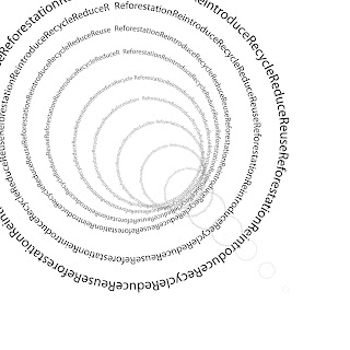
This design I believe is a symmetrical design. I would have liked to have it be a little tighter, and run a bit longer, but for whatever reason I could not figure out how to do it.


This design I believe is a symmetrical design. I would have liked to have it be a little tighter, and run a bit longer, but for whatever reason I could not figure out how to do it.

Here is my other asymmetrical design. Not quite like the rough, but I'm still pleased with how it turned out. I feel like if I put in a little more time, this could be a lot stronger piece.

Roughs
Here is a few more symmetrical and asymmetrical designs that i came up with. I like these ones a bit more, I feel they are a bit stronger. Also included is a larger rough for one of my thumbnails.

I concluded that the rough above wasn't very good, so i came up with a few more, and ultimately chose these two.


I concluded that the rough above wasn't very good, so i came up with a few more, and ultimately chose these two.


Subscribe to:
Posts (Atom)